
How User Research Shaped the Redesign of the Innovation Fund’s Website
What happens when information is available on a website, but users cannot easily find it?
That was one of the questions we started with when redesigning the website of the Innovation Fund of Montenegro. The goal was not simply to give the website a new look, but to better understand how users actually navigate it and, based on that, create a simpler path to the information they need.
The Fund’s website is one of the key channels through which businesses, startups, researchers and other stakeholders access information about support programmes, open public calls, application requirements, documentation and the Fund’s results.
“We wanted the website redesign to be about much more than a new design. It was important to us that the way we communicate with users be transparent, professional, clear and open. If we want to be a modern institution that supports innovation, the way we provide information to users needs to reflect those standards. That is why, before the redesign, we wanted to understand how users actually navigate the existing website, what matters to them and where they encounter obstacles,” said Dragana Latković, Public Relations Adviser at the Innovation Fund of Montenegro.
First the research, then the redesign
In cooperation with the DAMAR Institute, the Fund conducted a neuromarketing study of the user experience, which served as one of the important inputs for the redesign.
The aim was to use objective indicators of user behaviour to identify where users encountered obstacles on the existing website, what attracted their attention and where they experienced difficulties, confusion or delays.
The study involved 38 users, including existing Fund beneficiaries as well as people who had not used the Fund’s programmes but had used the website. The research combined eye-tracking technology, observation of user behaviour while completing specific tasks, and users’ own assessments of the clarity, usability and overall organisation of the content.
Particular attention was paid to finding public calls, application requirements and procedures, documentation, results of previous calls and contact information.
By combining these methods, the research provided insight not only into what users said about the website, but also into how they behaved while trying to find specific information or complete a particular task.
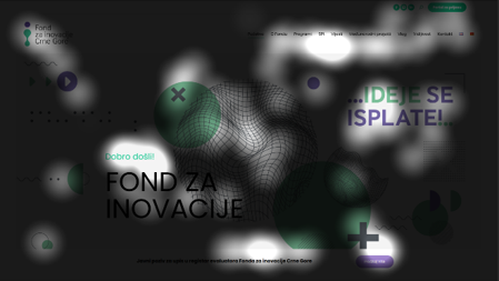
Eye tracking analysis of the user experience on the Fund’s existing website. The visualisation shows where users directed their attention while completing specific tasks.
“Surveys tell us what users think about a website, while this type of research allows us to see what actually happens while they are using it. By tracking users’ gaze and their actual movement through the website, we can identify obstacles that users themselves may not even recognise,” said Miloš Borozan from the DAMAR Institute.
What did we learn from users?
The results showed that the issue was not simply whether information was available, but how easy it was to find and understand.
Only 15 of the 38 participants (39.5%) managed to find an open public call. On average, they reached it through around 34 clicks and 11 pages.
Only 10 of 38 participants (26.3%) managed to find the application documentation.
Information about previously funded projects proved to be the biggest challenge. Only seven participants (18.4%) found it, and those who did needed, on average, more than six minutes, 52 clicks and 18 page views.
One particularly telling finding was that, after an unsuccessful search, 24 of the 38 participants concluded that the Fund did not have or publish information about previously funded projects, even though that information was available on the website.
The research also showed that users did not always clearly distinguish between information needed to understand the application process and the actual submission of an application. As a result, 14 participants, while looking for application documentation, ended up on the application submission portal instead.
Contact information presented a different picture. All 38 participants found it in less than one minute.
“A good digital service is not one where information simply exists, but one where users can easily find it. One of the most important conclusions of the research is that Fund users were not necessarily looking for more information. They were looking for a clearer path to the information they needed,” said Vuk Čađenović from the DAMAR Institute.
From research to redesign
The research findings were used to inform the redesign, particularly the organisation of information, navigation, visual hierarchy and the way users access key content.
Instead of the previous structure, which largely reflected the Fund’s internal organisation, the new website is organised around the tasks users come to complete.
Current public calls are highlighted on the homepage, application requirements and documentation are directly linked to each call, while previously supported projects now have a dedicated, searchable section. Navigation has been simplified, and the visual hierarchy has been adapted to the areas where users most frequently focused their attention, according to the eye-tracking analysis.
The research findings therefore became the basis for concrete changes to the website. At the same time, the experience of the team that works with users every day helped turn the research findings into practical solutions.
“Through our everyday communication with users, we see that they do not come to the website simply to read information. They come to complete a specific task. That is why it was important for us to organise the website from the perspective of their needs, rather than simply reflecting the Fund’s internal organisation,” said Ksenija Jovović, Head of the Applicant Support Department at the Innovation Fund of Montenegro.
Stevan Šandi from Bixbit also emphasised the importance of using data in making these decisions:
“What helped us most was basing every step on data and measurements rather than assumptions about how users navigate the website. When the data shows that it took 34 clicks to reach a public call and identifies which elements distract users’ attention, decisions about what should remain on a page are no longer a matter of taste. We expect future user experience research to show significant improvement compared with the initial results,” said Šandi.
A new visual direction
The redesign also introduced a new visual direction, with design viewed not simply as a matter of appearance, but as part of the overall user experience.
Particular attention was paid to content clarity, navigation, visual hierarchy, accessibility, a sense of trust and alignment with the Fund’s institutional character.
“When developing the visual direction, it was important to us that the website not only look more contemporary, but that the design also support the way users access information. That is why we paid particular attention to visual hierarchy, content clarity and navigation, so that users can find their way around the website as easily as possible,” said Nina Pićurić, Adviser in the Applicant Support and Contracting Sector.
The redesign is also a practical example of how a research- and data-based approach can be applied to the Fund’s own communication and digital services.
Information that can be found, understood and used
The aim of the redesign was simple: to make it easier for users to find what they came to the website for.
Whether someone is looking for information about the Fund’s programmes for the first time, preparing an application, searching for documentation or exploring projects that have already been supported, the goal is to make the information they need easier to find, understand and use.
“Transparency, for us, does not simply mean that information has been published. It means that users can find, understand and use that information. That is the standard we want to uphold through the redesigned website as well,” Latković added.
The website redesign is the result of joint work by the team of the Innovation Fund of Montenegro, the DAMAR Institute and Bixbit, and is an example of how science, technology and innovation can be brought together and applied in practice to provide users
AI Assistant innoBot – Beta Version
The redesigned website also introduces a beta version of the AI assistant – innoBot, a digital assistant designed to help users find information about the Fund’s programmes, public calls, requirements and procedures more quickly.
innoBot is currently in the development and learning phase. Its knowledge base and responses are being continuously improved and reviewed to ensure that, over time, it provides increasingly accurate and reliable information aligned with the current content available on the Fund’s website. Users can already try it out, and their questions and feedback will help us further improve its performance.
The goal is for innoBot to become another simple and reliable way for users to quickly find the information they need.